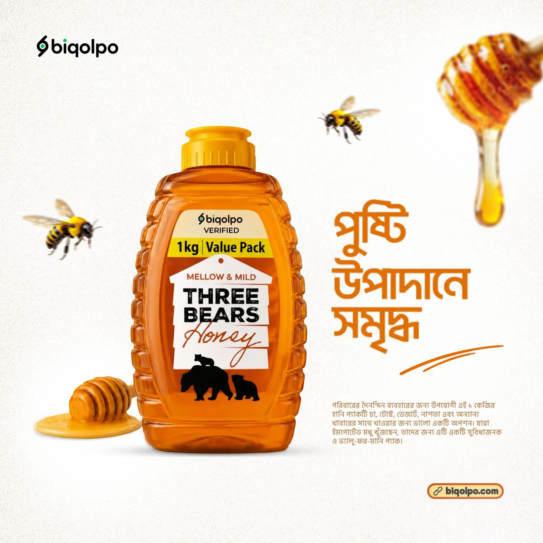
The Strategic Challenge
The organic honey and natural food sector is saturated with visual clichés: cartoon honeybees, dripping honeycomb sketches, and dated serif typography. While these signals attempt to communicate natural origin, they often position products as homemade cottage goods rather than refined, lab-verified, premium retail products.
Biqolpo sought to disrupt this category. Their objective was to introduce 100% raw, sustainably harvested mustard and mangrove flower honey at a premium price point, targeting health-conscious urban professionals who value both provenance and contemporary aesthetic elegance.
The Visual Direction & Geometry
1. Minimalist Honeycomb Monogram
I abstracted the hexagonal structure of natural beeswax combs into a disciplined geometric logomark. The monogram is mathematically constructed with subtle rounded inner apexes, honoring both the organic fluidity of raw honey and the precision of modern design.
2. Warm Obsidian & Amber Palette
Instead of the blinding yellows often found on grocery store shelves, we established a luxury color ecosystem:
- Raw Amber Gold: Inspired by unpasteurized mustard flower honey held against sunlight.
- Deep Obsidian Black: Provides contrast, maturity, and a premium tactile feel on packaging.
- Crisp Pure White: Ensures maximum legal nutrition fact legibility and certified organic seals.
3. Glass Jar Label Architecture & Foil Dieline
The wraparound jar label was engineered on textured uncoated paper stock with tactile gold foil accents for the primary wordmark. We positioned the label with an open vertical window, allowing consumers to see the authentic amber viscosity and clarity of the honey inside the jar before purchasing.
To complement the physical packaging, Subrata engineered a 12-tile continuous Instagram launch grid that told the story of sustainable harvesting, lab purity certification, and culinary pairing recipes—yielding a 3.4x lift in initial launch engagement.
Key Deliverables Produced
Commercial Impact
Following the brand rollout, Biqolpo established immediate premium shelf presence across specialty organic grocery outlets and achieved sold-out status for their inaugural harvest batch within six weeks of social media launch. The brand identity continues to serve as the visual standard for their expanding organic product line.